wim
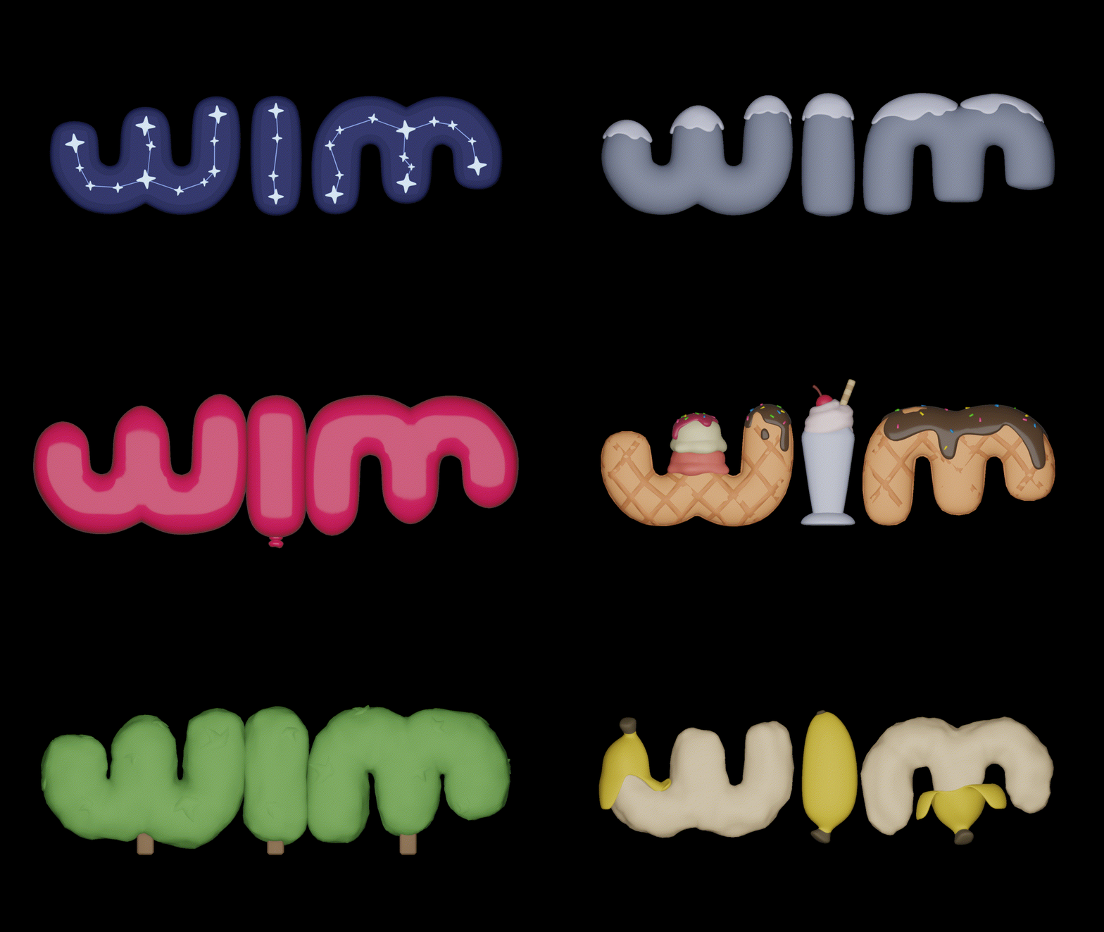
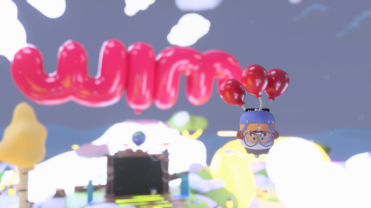
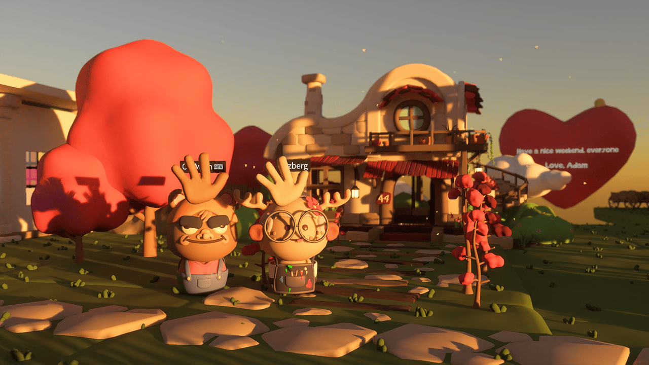
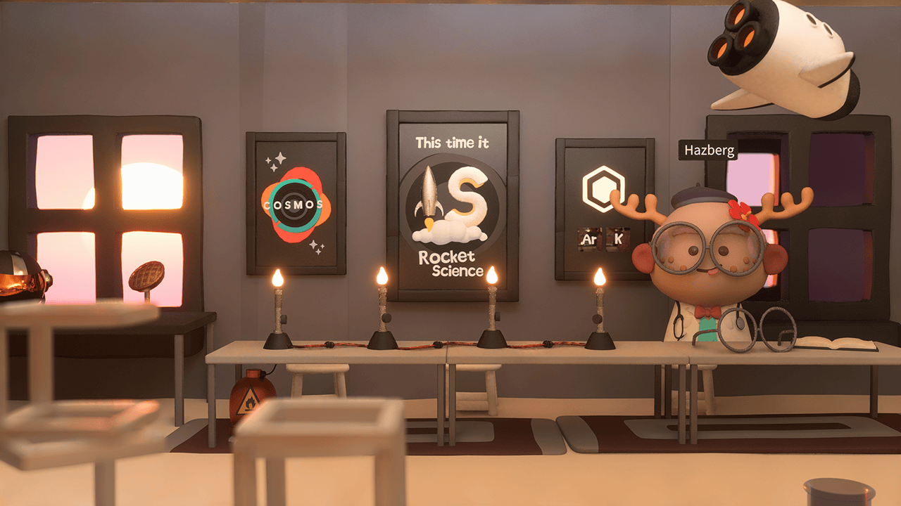
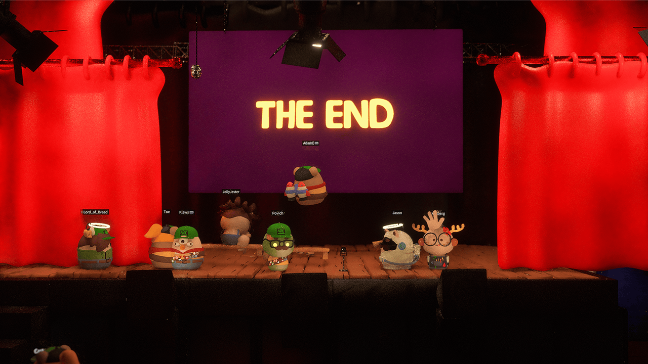
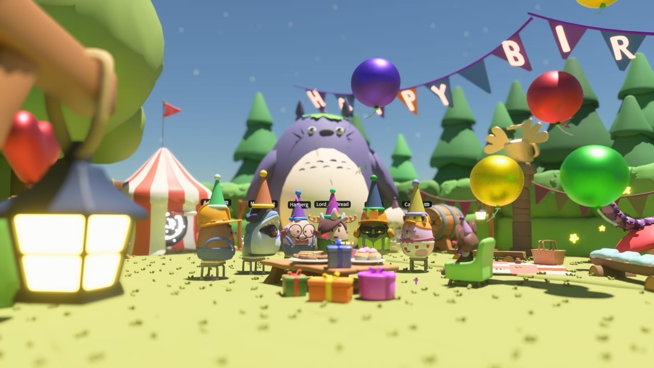
wim is a multiplayer, creative sandbox game where players build worlds with both friends and strangers in a weird and wonderful universe.
I joined the Player Tools team to help simplify the UX of equippable gadgets that players use to create worlds. This included interaction design, visuals and input control schemes for Keyboard, Gamepad and Touch.
My Role
UX Design, UI Design & Gameplay Programming
for Embark Studios,
Collaborators
- Creative Lead
- Doug Church
- Player Tools Lead
- Alex Camilleri
- 3D Artists
- Adam Edberg, Diego Goberna
Tool Simplification
- UX Design
- UI Design
- Implementation (Rust)
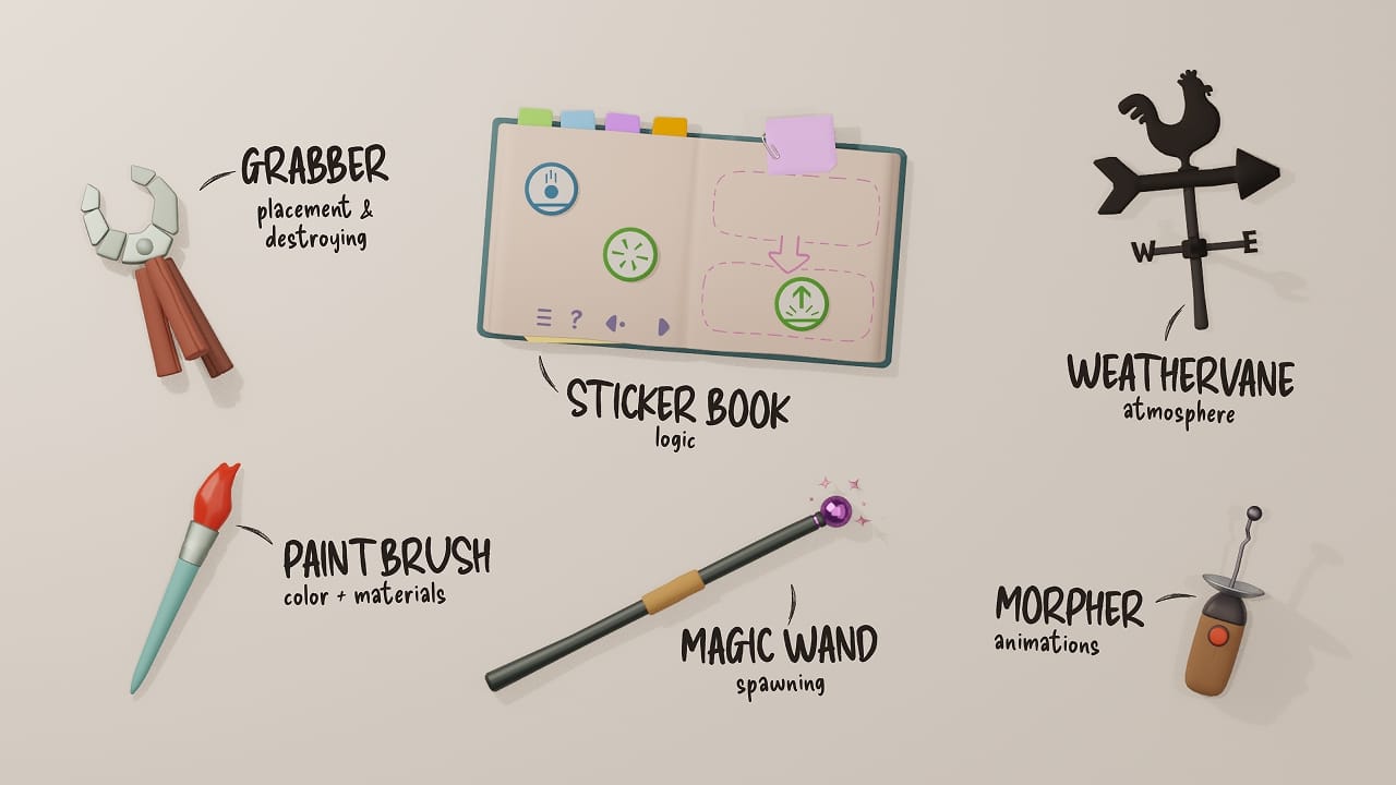
The core of all gameplay in wim was based around equippable “tools” that the player could use to modify the world. Over the course of development, many different tools were created as designers experimented and discovered what type of gameplay was fun. These experiments were often done in isolation which resulted in the individual tools becoming arbitrarily complex as well as lacking consistency in predictable behavior across the whole tool set.
My Responsibilities
- Reduce complexity of behavior and input mapping
- Understand which functionality was working well for our target audience and which should change
- Prototype and implement improvements so we could test in-engine
Key Questions
- Which tools are providing the core gameplay?
- Do the tools already share any common interaction behaviors on which we can converge?
- Is there unnecessarily advanced functionality that we can remove, given our more casual target audience?
The Problem
Tools were developed largely in isolation. Each tool had its own interaction behavior and input mappings and the lack of consistency often created confusion for players as they tried to navigate the equipped tool's specific functions. Additionally, some tools could switch modes meaning the available functions would change based on mode, increasing cognitive load for the player.




Although the tools had a lot of very advanced functionality, players were struggling even with the basic functions and were frequently confused by the many options.
Other subtle details exacerbated the problem such as the Input Hints bar specifying which hand the tool was in (a relic from when players could dual-wield tools) but not including the tool's name or current mode, as well as the technical action descriptions - These would all need to be improved.
My Proposal
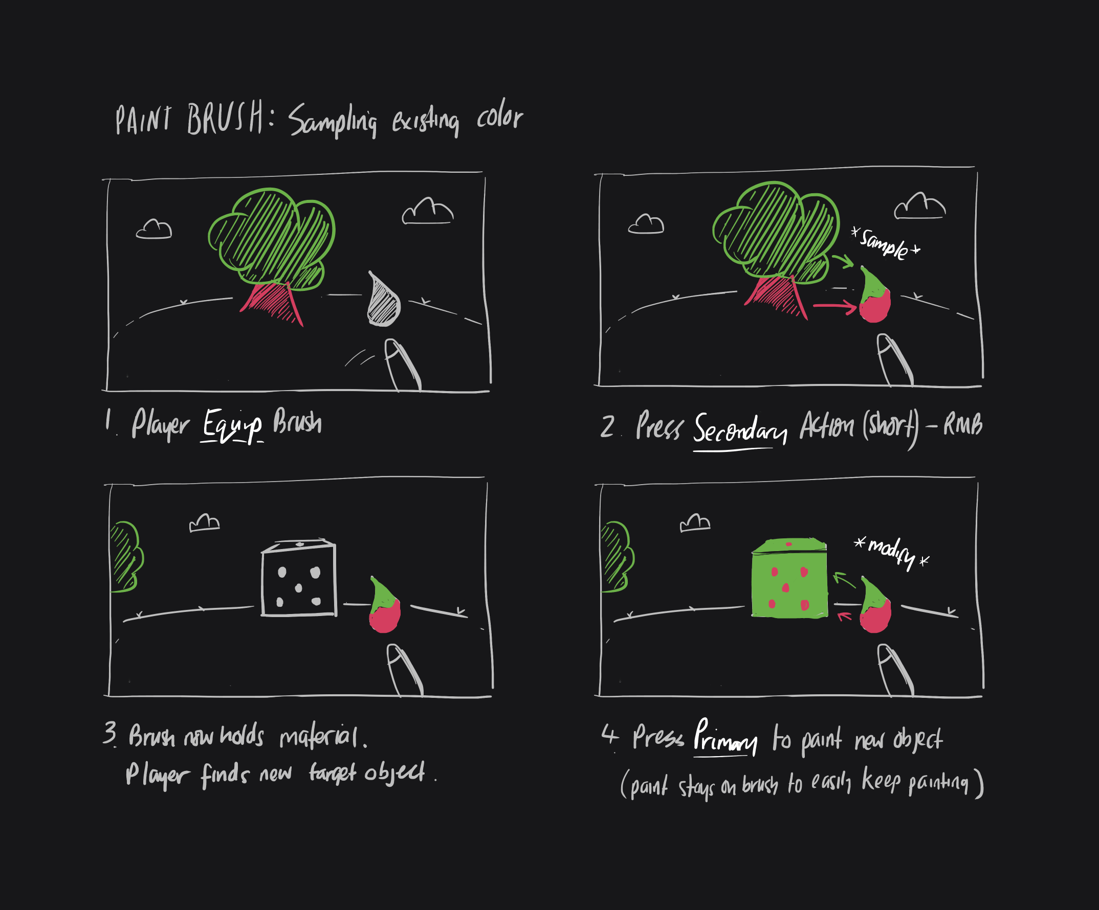
The game's core design philosophy was “Remix + Create”; strongly encouraging players to take existing things in the world and change them to create something new. I wanted to align categories of functionality and bindings across tools so that their core functions, which made up 95% of the gameplay, were mapped consistently. Players would then be able to intuit what pressing an input for a new tool will do based on their knowledge of how the others work.
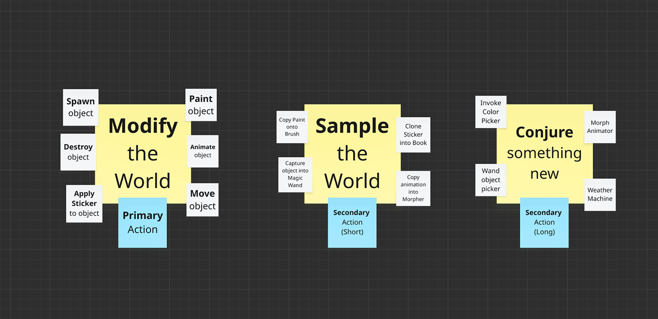
My idea was to reframe all tool functions as one of three categories:
- Sampling - Taking an existing aspect of the world so you can remix it
- Conjuring - Bringing something brand new into existence
- Modifying - Applying a change to the world with the tool
We would then introduce a new constraint that tools could have only a Primary action, a Secondary (Short) action, and a Secondary (Long) action, reducing the input binding needs to effectively 2 buttons for the core functions.
A tool's Modifying function would be on the Primary action and the Sampling and Conjuring functions on the Secondary Short and Secondary Long actions, respectively. This new constraint required a shift in how designers were thinking about tools, but I was confident that the simplified direction and consistency was worth the effort.
There were still many questions. At the time, the Grabber was responsible for destroying objects. Should we move that function into the Magic Wand for symmetry between creation/destruction? Should we make a separate destruction tool? Perhaps the Grabber just needed a more extreme animation for "crushing" something out of existence in addition to picking things up? These were the type of thoughts as we embraced a redesign.
| Tool | Action | Effect |
|---|---|---|
| Paint Brush | Primary | Apply color from Brush to Target object ("Modify") |
| Secondary (Short) | Copy color from Target object onto Brush ("Sample") | |
| Secondary (Long) | Invoke Color Picker ("Conjure") | |
| Magic Wand | Primary | Spawn an instance of the captured object into the world ("Modify") (Destroy an existing object if in destruction mode?) |
| Secondary (Short) | Capture a copy of the target object into the Wand ("Sample") | |
| Secondary (Long) | Invoke Object Picker ("Conjure") | |
| Morpher | Primary | Apply captured animation to target object ("Modify") |
| Secondary (Short) | Capture the active animation from the target object ("Sample") | |
| Secondary (Long) | Invoke the Animator controls to create a new animation ("Conjure") | |
| … | ||
The Outcome
The first tool I updated with the new UX was the Paint Brush. Playtesters immediately noticed how quickly they could sample existing colors they liked from the world to use on their own builds. The ease of the Remix flow meant that picking colors was no longer such a frustrating process, which was great to see.
Following that success, I updated the Magic Wand. Previously the Wand would open an object picker for its primary action, which was incredibly slow when players wanted to spawn multiple objects. With the new flow, players could sample an existing object with the secondary action to capture it in their Wand and then use primary action to spawn any number of instances into the world. This was a huge speed improvement and really helped strengthen the game’s Remix philosophy.
An additional benefit of reducing tool complexity to only primary/secondary actions was that input bindings became much simpler, especially for Gamepad and Touch controls that have more limited options than Keyboard. Now, we needed only 2 inputs to achieve the majority of the tools’ functionality, which was a massive win.
Paint Brush Color Picker
- UX Design
- UI Design
- Implementation (Rust)
In addition to updating the Brush to the new Remix-focused flow, I took the opportunity to improve how the Color Picker functionality worked now that it no longer needed to be the primary method of selecting colors.
My Responsibilities
- Design a simpler process for picking colors
- Present new ideas to the team and get buy-in
- Implement the improved version in our custom Rust Engine
Key Questions
- Can we remove any unnecessary functionality?
- How can we tie this in with the Remix philosophy?
- Can we make the functionality modular to share with future tools?
The Problem
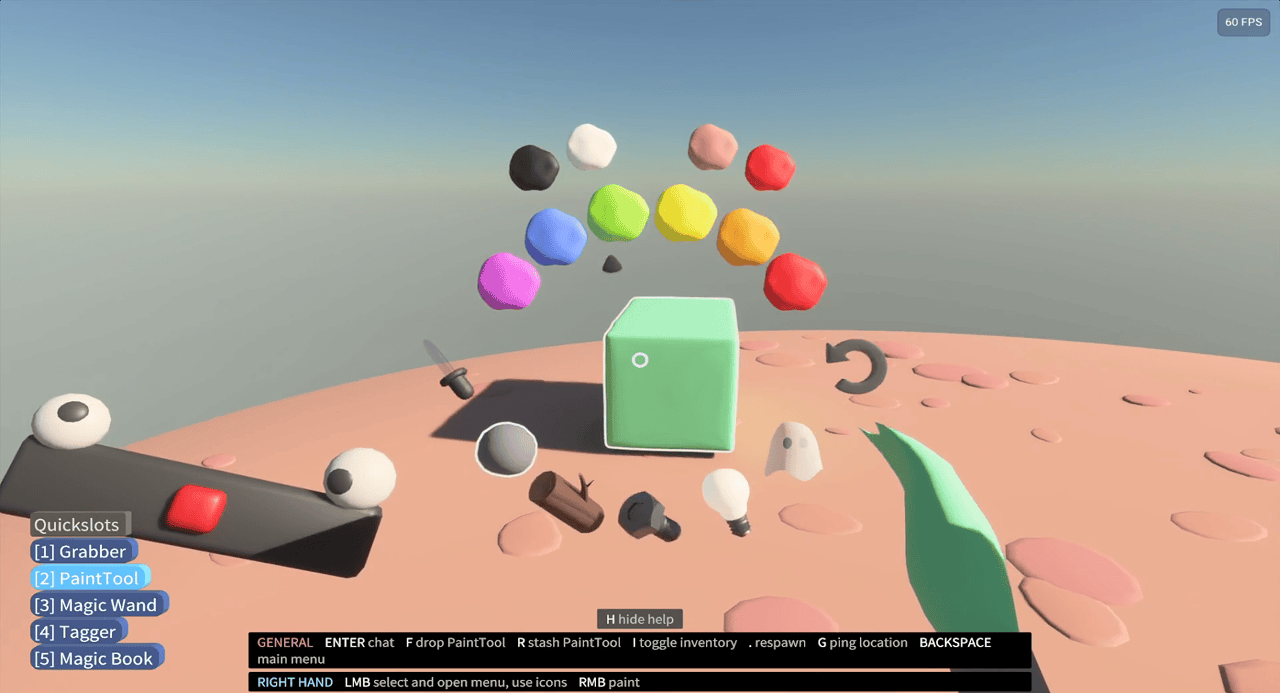
The original color picker enabled precise control by adjusting values over time, slowly moving towards a new color the longer you held one of the control blobs.
For example, with a starting hue of green, players could click and hold on red and the hue indicator would slowly move through yellow → orange → red. The same interaction was used for the Brightness and Saturation controls.
Players didn't understand that the buttons were press-and-hold and found these interactions incredibly slow and frustrating to use when they just wanted a simple color that looked good. Additionally, players struggled with the unlabeled Brightness and Saturation controls.
Overall, the picker was just too complicated for a casual player.
My Proposal
I wanted to simplify the act of picking a color entirely. Having already updated the Paint Brush to use the new Sampling approach as part of the wider tools redesign, players could now take an existing color from the world in a single action. I wanted to bring this simplicity to the Color Picker also.
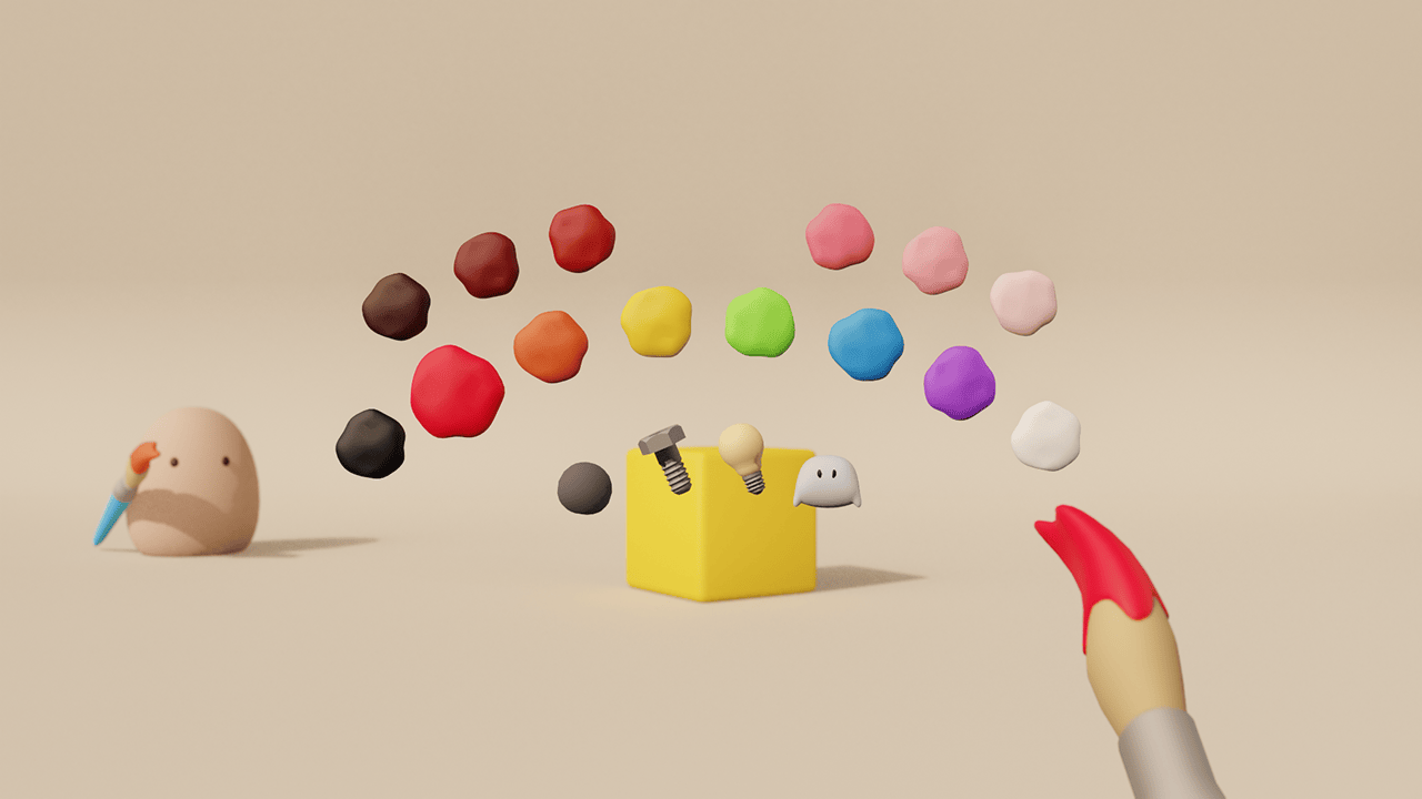
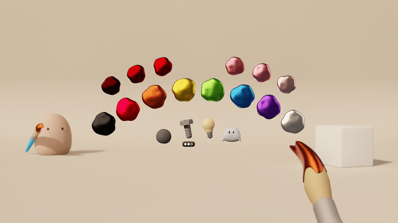
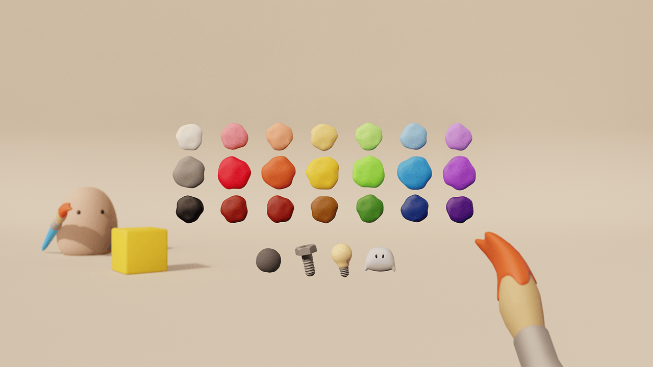
My idea was to replace the granular controls with a simple palette of colors from which the player could pick. The tradeoff was that very advanced players no longer had precise control of the exact colors, but the majority of our casual player base would have an easier time picking colors that already looked great with minimal effort. I was confident that the tradeoff was worth it and the team agreed.
One additional benefit that the broader tool philosophy changes creates was that the Color Picker UI no longer needed to be attached to a single Target object. Instead, players were free to invoke the Picker at any time and load colors onto their Brush before considering any targets. This meant the previous layout with the target centered had flexibility to change.
The Outcome
Moving to a preset palette approach was very well received during playtests. Players could quickly pick a new color that they knew would work well with the others without fiddling with overly-granular value adjustments. This approach meant our team could offer different themed palettes or even enable players to build and save their own, which massively increased satisfaction when building beautiful, colorful worlds.
There was still a lot I wanted to explore with how to improve this experience further, especially around material selection and handling multiple material slots on individual objects, but this felt like a great start in the right direction.
HUD Quickslots
- UX Design
- UI Design
- Implementation (Rust)
In addition to the tools, our team was also responsible for the player's Inventory and the associated Quickslots view on the HUD.
For a long time, the Quickslots existed as a simple text list on the HUD using a crude semi-3D label setup (See Figure 2.1). While it was fairly functional, the team agreed that it felt very much like a placeholder and should be redesigned.
My Responsibilities
- Iterate on the current design to provide options to the team
- Create functional prototypes and validate during internal playtests
- Implement and polish our chosen design in-engine
Key Questions
- Which information does the player actually need moment-to-moment?
- How would this feature translate to mobile?
- What are our technical limitations for HUD work?
The Problem
I didn't want to reinvent the wheel, as the Quickslots pattern has featured in many games with well-proven designs.
However, where wim differed from a typical game was in the art direction and technical setup:
- The creative direction was to use only 3D meshes. As a result, the engine did not support 2D textures for things like icons on a HUD.
- The rendering setup meant that world lighting would interact with 3D elements on the HUD, which was something we'd have to consider in the design.
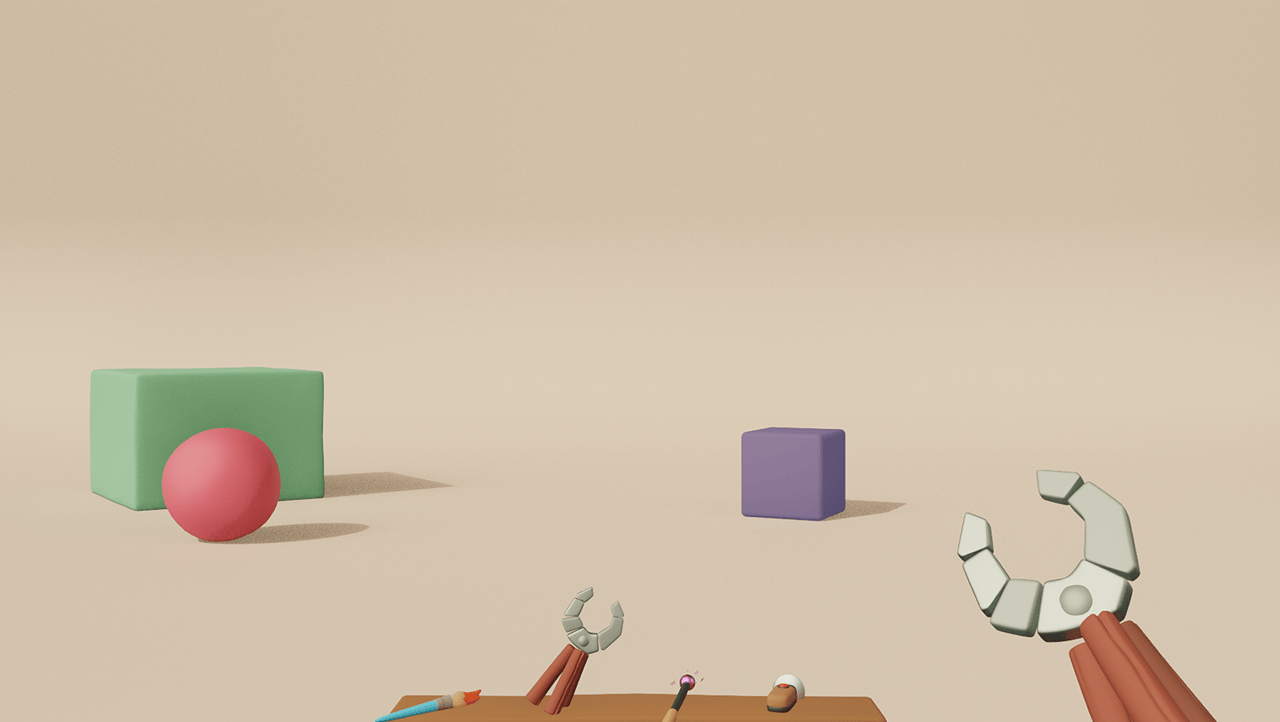
Our Inventory UI at the time was a wooden “Bookcase” visual, so I initially tried to bring that theme through to the HUD by making the Quickslots into a wooden shelf. However, it quickly became obvious that most of our tool meshes did not sit very believably on the flat shelf, so we needed another approach.
My Proposal
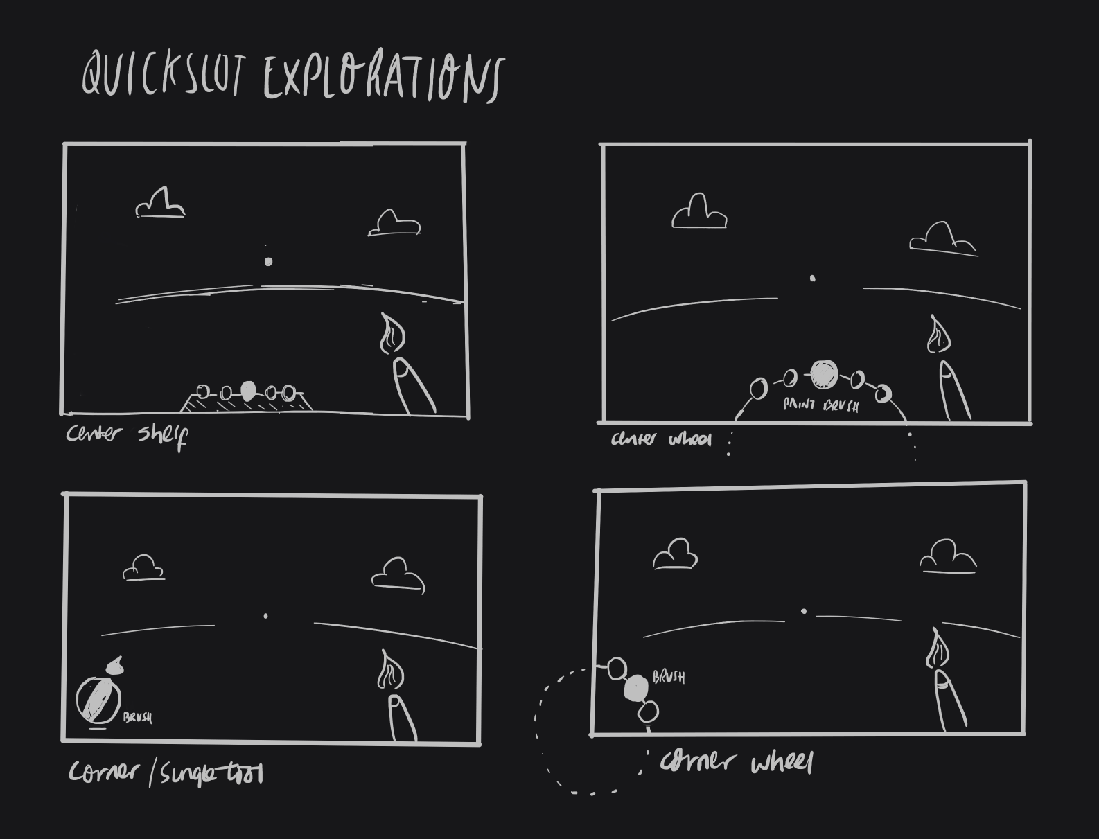
After considering different layouts, as well as discussing whether we actually needed to show all of the tools the player had in their quickslots, I decided to try a different approach.
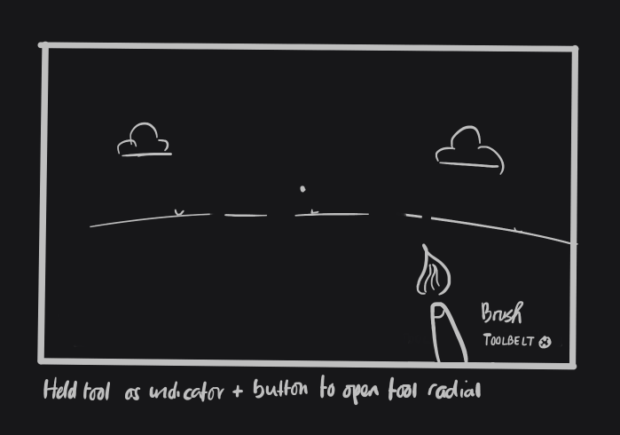
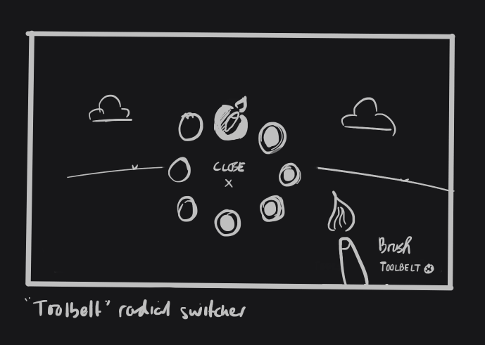
The equipped tool was already visible on screen in the player's right hand. Duplicating the tool visual on the HUD, especially as another 3D mesh seemed redundant. Additionally, we had already begun using a radial menu for Inventory functionality on mobile as a space-saving choice and it seemed like we might be able to carry that over here.
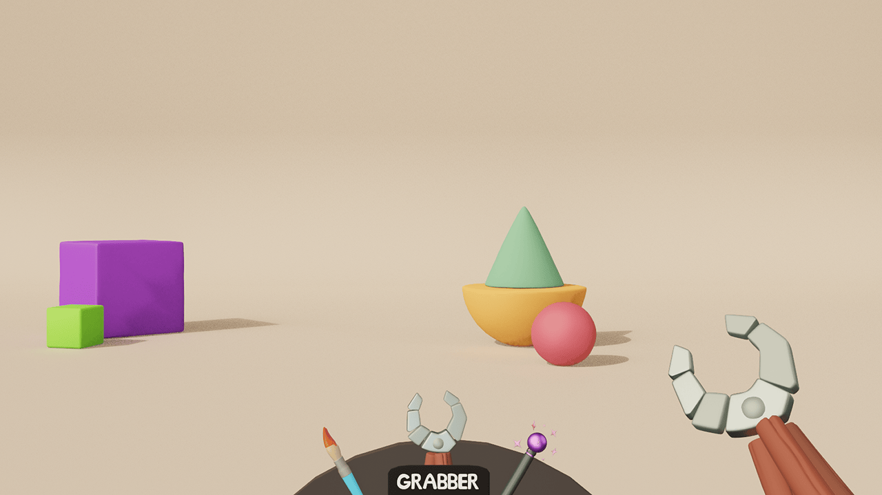
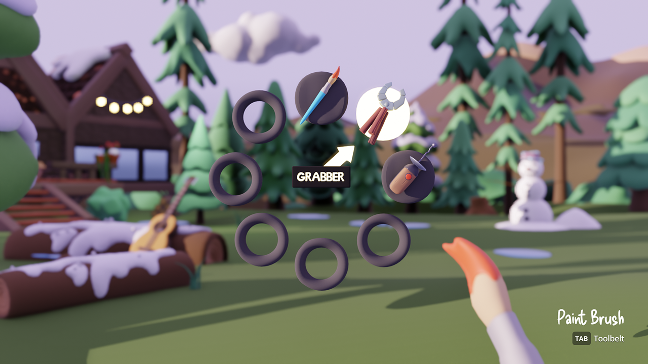
For this reason, I wanted to try decluttering the HUD by removing the Quickslots entirely and moving to a radial menu as the primary mechanism for seeing and switching the tools in your toolbelt.
The Outcome
Radial menus are a tried and tested pattern that we were very confident would already work for our use case, especially as it can be seen in many existing games for this exact function. Thankfully this held true here and the pattern worked well to enable quick-switching between tools in the toolbelt, as well as improving consistency with the UX across desktop and mobile.
We were able to keep the 1-8 input bindings for Keyboard and players quickly memorized their tool positions and could switch with a flick of the mouse or analog stick, or by using their old hotkeys.
Decluttering the HUD even further was a welcome change and helped increase player immersion in their worlds, which supported the game's broader goal of guiding players into a creative flow state.
There were of course many, many other challenges that would be too much to show here but I'd love to chat more about the problem-solving in this unique and wonderful project! :)